We’ve Moved!


If you aren’t redirected here is the link:


Remodelaholic!


THANKS!

Showing posts with label Design. Show all posts

Win Free Carpet! Everyday for a Month...

01 September 2011


Remember way back when (this summer has flown by!)... okay just a month ago when I posted about my trip to North Carolina and the room Roeshel ( DIY Showoff!) and I designed for Shaw.  Well I didn't tell you that it is part of a design competition and I NEED YOUR VOTES EVERY DAY THROUGH THE 30th of September!  pretty PLEASE!  and THANK YOU!


Here are the details:


Shaw is hosting 30 Days of HGTV HOME beginning today!
To enter the sweepstakes, all you have to to is:
·         Like Shaw Floors on Facebook (www.facebook.com/shawfloors)
·         Enter their email address in the 30 Days of HGTV HOME tab
·         Vote for your favorite room  (it will look something like this:)


By entering the sweepstakes, you can also get a voucher to receive a free HGTV HOME tote bag and a free HGTV HOME area rug with purchase. 

Wanna see some embarrassing videos...


THANK YOU!  

I will be back with more info soon!


Remodelaholic is written by Cassity and Justin. Cassity has a degree in interior design and Justin is a landscape architect, so we adore everything that makes up a HOME! We love to share home remodeling ideas and projects we’re working on. From huge kitchen renovation ideas to small bathroom remodels, there isn’t anything we won’t try to tackle (at least once!). We are in the midst of our third whole home renovation, (check out house 1 and house 2 as well, so there should be a lot more inspiration coming your way. We hope that you will stop by often for home design inspiration, tutorials, interior design tips, delicious recipes and what going on in our family life.

Read more...

Designing A Living Room With Tall Walls

22 June 2011

Designing A Living Room With Tall Walls
submitted by Live Beautifully


I recently gave you a little sneak peek of this project and am now ready to show you the living portion of it. As you can see in the before image above, the space was basically a blank canvas. My clients didn't know where to start in the space and in turn the space became a resting place for unmatched furniture and no commitments on the walls. Here is the space today after I got my hands on it...

Read more...

Classic * Casual * Home Tour!

23 May 2011

Classic * Casual * Home Tour!  by Mary Ann

When charming Cassity from Remodelaholic asked me to give you a tour of our 
1950's Newport Beach, California cottage I was thrilled and then a little nervous.  
Remodelaholic was one of the first blogs I started following--
and they know what they are doing!  I am not as handy as many of you, but 
I appreciate good craftsmanship and finding a deal.     

Welcome!
(After photo) We live on small property lots on Lido Isle 
but we are near the Pacific Ocean and enjoy a nice climate.
(Before) You can see that we tried to make the entrance more pronounced 
and added energy efficient windows. There is more about this project HERE.

Here is the living room before we installed new double paned French doors, 
an insulated ceiling and a new mantel.  Our energy bills are much lower
compared to a year ago.

The dining room before.
We arched the opening to raise it a bit, removed the window (plenty of light already) 
and removed the left door to make a walk in pantry in the kitchen on the other side.
More details HERE.

In the kitchen, we wanted to raise the ceiling and have better circulation around an island.
You cannot tell it from the photo but the cabinets were falling apart.
Our kitchen after...you can see lots more photos of the room, pantry, 
beverage center and sitting area HERE.

Our son's bath before and 
after...see all three, including master bath remodels HERE.
His bathroom was decorated with flea market finds.

We had to maximize storage in our tiny guest room.
 There is more about this here.

The stairwell up to the master bedroom had a door at the bottom. We removed it, 
tore down part of the wall and built a new banister.
I will have more posts on the upstairs 
including the office loft space and master bedroom when we have
a few more details completed.

The laundry room before and
 after.  We repurposed the kitchen counters here and bought the sink and faucet from 
Overstock.com and hardware from Target.  Read more about the 
laundry room project HERE.

The patio fountain was made out of an 19th century French animal trough that
you can read about HERE.  We'll be spending more time out here
now that it is getting warmer.

 Thanks, Remodelaholic for letting me give you a tour of our happy home.
Best wishes,

Read more...

Wooden Curved Canopy Top Instruction

31 January 2011

Wooden Curved Canopy Top Instruction
contributed by DeCarlo Woodworks


Ok, this time around we're going to make a curved bed crown. The same frame is used for all of the crowns of this type. I usually make the frames ahead of time, this way all I need to do is cut and apply the face. I have many designs but this time I'm making a new design, so you get to see how I go about making the design and the templates. 

Luckily, I had the top and bottom frames cut already. Don't worry I'll show you how I made them. First, I cut the blanks from a sheet of 1/2 inch plywood, 21 x 5 (good thing I made notes on the jig, my memory isn't as good as it once was). Then I place the blank in the jig and trace the arch. I take that over to the band saw and cut the waste off about 1/16 to 1/8 from the line. Then I clamp it into the jig (using the hold downs shown in the picture below) and run it through the router equipped with a flush trim bit. As you see below the arch is pretty good! The best part, every blank comes out exactly the same!


Second, I have to cut the groove for the back. The trick here is to leave a  3/4 inch space for the french cleat to fit even with the top and bottom frames. After installing the dado cutters in the table saw, I use the actual cleat to space the fence properly. So, now when I run the frames along the fence, the space will be perfect for the cleat. 


Read more...

Kitchen Designed With A Clear Vision

04 January 2011

 Kitchen Designed With A Clear Vision
contributed by Honey We're Home

The kitchen often sets the tone for a home and that is no different in our house.  It’s the first place we head to in the morning for our daily coffee, where countless meals are made, and the days’ events discussed.  Where bottles are washed and baby food is pureed.  
When we began designing our home, the only room I had a clear vision for was the kitchen.  After pouring over decor magazines and design blogs for about a year, the images that kept appealing to me over and over had three things in common {white cabinets, white subway tile, and carrera marble counters}.  After living in a townhouse with dark wood kitchen cabinets, black granite counters, and forest green walls, I knew I wanted a kitchen that was light and bright.  We configured the floor plan so that we could have a kitchen window and ended up with two:)  I’m so happy with how our light and bright kitchen turned out.
Come in, come in!  I can’t wait to show you!
image
In an effort to keep the kitchen from being too blindingly white, we went with dark hardwood floors and island, and stainless steel appliances.  The marble is gorgeous, but we do have to be careful with it.  It scratches and stains easily.  I realized early on that I had to “let it go” or I would go insane noticing every tiny flaw.  To keep my sanity, I typically keep two large cutting boards on the island to prepare food and set things on.
The island was also designed with two shelves to hold my cookbooks, a second small sink for food prep (which is actually really handy), and three deep drawers on the far side.  I love these drawers!  The top one houses plastic bags, foil, plastic wrap and measuring cups/spoons.  Second drawer holds Tupperware and the bottom one keeps paper towels.
image 
The far cabinet doors are glass to give the space an open feel.  That is the cabinet I keep our daily dishes like plates and bowls in, so it’s always organized. 
image
This little area to the left of the fridge is command central.  It’s where the coffee is made every morning and where I prepare my oatmeal.  Our coffee mugs and glasses are kept in those cabinets.  The microwave was originally intended to sit at the cabinet height, but that is too tall for this shorty, so we moved it to below.  I will have to safeguard it since we have a little one that will be into everything soon.
image 
image
On the opposite side, is the double oven and range.  It’s nice to have a combination of drawers and doors for storage. 
image
image
If you continue past the oven, you’re into the “mudroom” and the pantry is on the right.  Out the door is my garage.  
Table, shower, media 012
And we opted for one large farmhouse sink.  Love the natural light that the windows provide.
Table, shower, media 018  
We wanted the kitchen to open to the living room, but not completely, so that you still have a little separation.  I like how there is some divide between the rooms.  The pendant lights (one of my absolute faves) are from Lighting Inc. in Houston, Texas.  They really add that bit of drama and are what most people comment on when they come over.  They also look really cool at night.
image
image
If you have any questions about our kitchen, let me know and I’ll do my best to answer them for you.  You can see my inspiration kitchens here

Read more...

New Dining Room Furniture & Design: Guest Remodel

18 August 2010

The Nest on The Hill  has gone all out with new dinning room furniture and wall art to help with the plain walls in their dinning space.

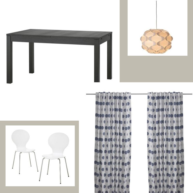
My first instinct was to go gray in the dining room. I knew it would play well off the green from the living room but allow us to use different colors. Beyond the gray and a pair of curtains I liked, though, I was at a bit of a loss. I played with a mood board a bit, but still wasn't quite sure on the details. 


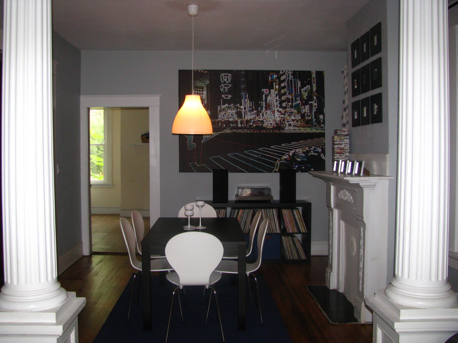
See that? The giant empty wall straight ahead? That wall was driving us insane. We knew we had to have something pretty eye catching, as that wall would be the first thing anyone saw when walking in through the living room. The hard part was finding something we loved that didn't cost a fortune. And along came Ikea...


I don't know which one of us pointed out the city print first, but we both stared at it a bit and then committed to liking it...but being afraid of it. It's huge. At over 6 feet wide and 4 feet tall, it fit the bill for our big, affordable art piece but we just were not quite sure how it would fit. After staring at it for a good fifteen minutes, we sucked it up and brought it home.  


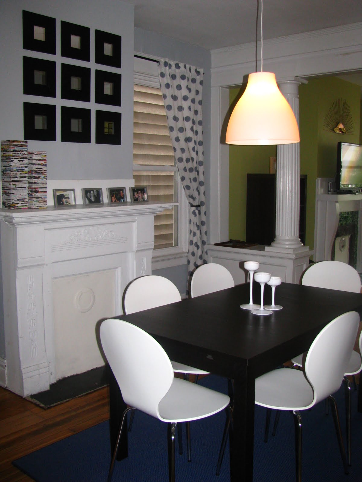
It ended up fitting quite well with the rest of the room and now we both love it. I had bought the vases made from magazines from Marshall's on a whim the day before our Ikea trip and, after buying the print, we loved that they look like skyscrapers.  


Our Ikea table and Target chairs rounded out the room and all that was left was for us to switch out the chandelier-ish light for a new one. Little did we know, that task would end up taking two days and about 100 trips to the fuse box...


What a great change with the new dining room furniture and wall art!  It all turned out very nice!  How do you like it?

Read more...
Related Posts with Thumbnails
Emealz - Easy Meals for Busy People!
Home & Garden Blogs Home & Garden Blogs - Blog Rankings

Blogging  tips, tutorials and SEO

From Here to Eternity

  © Blogger template On The Road by Ourblogtemplates.com 2009

Back to TOP