Built in Hutch Transformation
29 April 2011
Hi, I am Tracy from Tracy’s Trinkets and Treasures. It is so exciting to be guest posting at Remodelaholic. I couldn’t say yes fast enough when Cassity invited me to show you my hutch transformation.
Getting the courage to paint this hutch took me forever.
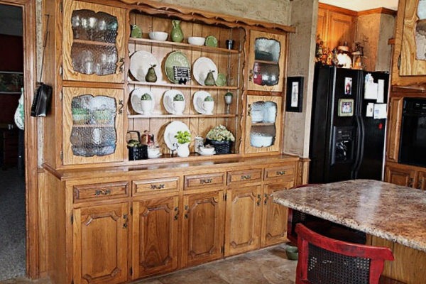
Looking at it now makes me wish I had painted it long ago.
Last summer, in July, I posted that I was thinking of making some changes to my kitchen and breakfast area. I did change up my breakfast area that you can read about here, but I kept putting off the hutch.
One day in March I decided to remove the cabinet doors on the top part to see if it looked better.


Somewhat better, but messy. I knew I would need storage that would hide the clutter, but look good. I found the perfect solution at Target.
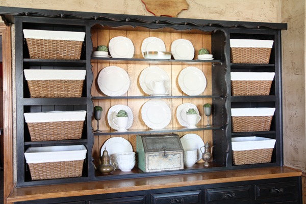
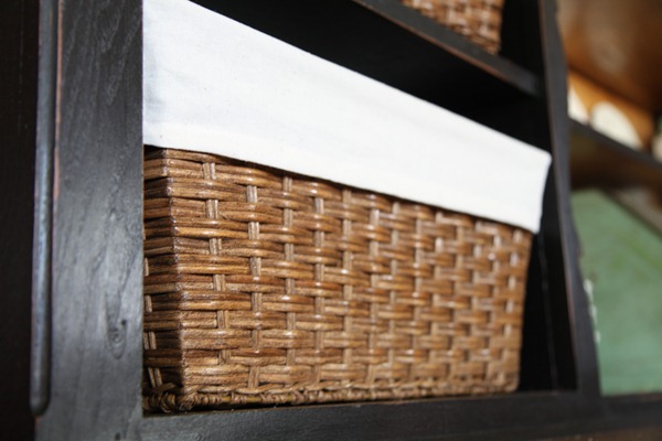
The baskets fit perfectly in the space and the color is the same tone as the unpainted wood. The baskets came with the liners and they really helped lighten up the black paint and tie in the off white dishes.
When I bought the baskets I discovered that Target online offered the them at a discount and free shipping.
One of the reasons I put off the redo was the prep work and the thought of using oil based paint. A friend of mine painted her cabinets and used this acrylic latex paint.
I decided to follow her recommendation since I really dreaded the thought of oil based paint because I can be messy and impatient. Oil base paint takes much longer to dry. This paint didn’t have much odor and dried so fast. The color is Tricorn Black in a satin finish.
I didn’t want it to be big, black and glossy.
Before I painted I did clean the hutch with TSP and used a DeGlosser. I think soap and water would have been fine instead of TSP.

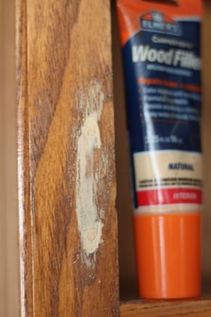
I used wood filler to fill in the holes where I removed the cabinets.
I rolled on a thin layer of acrylic all purpose primer to the hutch, doors and drawers with a small sponge roller.

I was going to roll on the black paint, but it didn’t seem to roll on the way I wanted it to so I grabbed a Purdy brush and it worked much better. Even if the roller worked I would have needed to brush paint in all the crevices and the shelves where the doors were removed. I didn’t think the brush marks were noticeable. I applied 2 coats of paint.
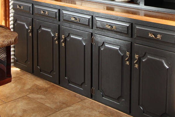
The pulls that didn’t look gold before suddenly looked very gold when they were put back on the cabinet doors and drawers. ( Oh a little tip for you. I numbered all the drawers and doors so I could put them back where they started. I didn’t have any issues with doors or drawers not fitting so I think it helped.) I needed to touch up a few spots that my tired eyes didn’t see the night before and I lightly brushed some paint onto the handles to see what happened. The gold was toned down and the pulls no longer glared at me.
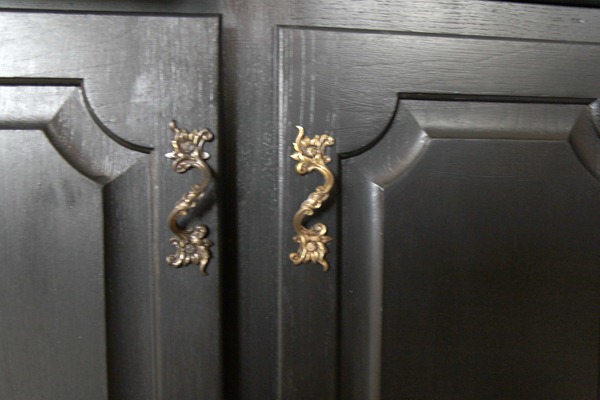
The paint on the pulls has held up and not rubbed off at all.

I also decided the black was a bit too much and needed a distressed look, but I didn’t want to sand the hutch. I did an old trick I have done many times in the past. I used paint to simulate distressing by putting a small amount of paint on the brush and using the side of the brush along the edges to create a faux distressed look.
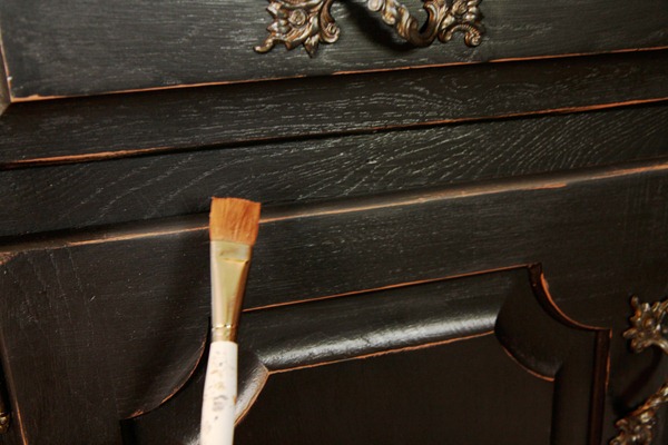
I used my craft acrylic paint…. in Autumn Brown because the color went well with unpainted part of the hutch.
Here’s a few more photos of the finished hutch.


Thanks Cassity for letting me show off my transformation on your blog and to your readers for stopping by.


20 comments:
Gorgeous!
xo, Mallory
holy moly it's gorgeous! I did not see that beautiful cabinet under the old one at all! Nice job!
The Hutch looks fabulous. Mimi xx
This is bootimous! I love it...great tutorial!
That is fabulous!! What a project!! Fantastic job! If I were you I'd just sit in that kitchen all day long staring at it lovingly!
Lovev, love, love Tracy's hutch and Tracy!! Thank you for sharing today!!!
Very clever with the faux distressed look, I NEED you to guest post on my blog very soon!
Sarah
WHOA!!!!!!! I SOOOOO love this hutch transformation. This is sooo stunning, I love your choice of black, so rich, elegant and love the brass hardware..again such a perfect choice!! You did such a fabulous job. Bookmarking this so I can come back and drool some more :)
Tracy did such an amazing job on this transformation. I know it was a lot of work but what a difference!
Wowzas!! This really turned out beautifully!
beautiful!!! I love your distressing trick- my lazy self will definitely try that!
I adore this! You did a wonderful job!
~Terry
amazing!!!! the transformation is incredible-looks straight out of a magazine. love it. GREAT JOB!
Wow, that looks 1000x better! So much cleaner and way more modern looking.
Anna
www.askannamoseley.com
Seriously FANTASTIC! SERIOUSLY!!!!!
So beautiful! I can totally see those other two doors near the hutch being painted and "distressed" the same way. great job!
And maybe you mentioned it and I missed it, but can you tell us why you chose to not paint the back "wall" of the hutch behind the plates? It looks fantastic, not a criticism at all, just curious.
What an amazing transformation. Well done.
www.timberandlace.blogspot.com
Wow! That's an amazing transformation! I've been trying to convince myself to paint a few hardwood pieces myself and haven't given in quite yet. Now that I see your hutch, I'm just a step away from buying some paint.
Might I suggest you paint the back wall of the shelving. I think it would make the white and green accents the focus and not the wall behind them.
All in all, it's beautiful either way. Well done!
I didn't paint the back wall because I am leaving my cabinets unpainted and I thought it would help to make the hutch go with the oak cabinets if I left the back wall and top unpainted.
Post a Comment