Carrie From Confessions of a Former Messie linked up her part 1 of her ENTIRE house remodel... uh, can I say WOW! They have done incredible things, just wait until until you read this... I am anxiously awaiting Part 2. Check out what they did.
We began our whole house renovation several years ago with the purchase of this old, neglected home. For some reason, my husband saw a world of potential from the very first walk through. It took several months, but I finally caught his vision and got excited about this house. We liked the overall floor plan, but it just needed a few… adjustments. We moved doors, moved windows, moved interior walls, took out closets and made new ones. Now that the bones are in order, we’ve got a great house to work with! We’ve got a long way to go, but we’ve come so far. There’s been much progress since these photos were taken, so I’ll be sure and post a room by room snapshot of where we are now. I’ll apologize now for my lack of photography skills…. sorry, folks! I’ll also apologize now for the excruciatingly long post… so sorry! It’s a big project!
I’ll take you through the exterior of the house and through the main living areas in this first post. I’ll post the progress so far for the 4 bedrooms and 2 and a half baths later.
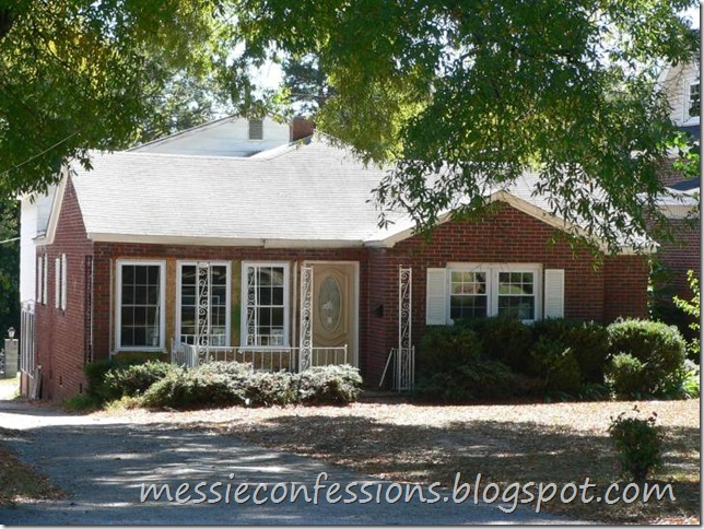
Here’s what the front of the house looked like before (notice the long, skinny windows) …
Removed the skinny windows and framed up normal ones…
Replaced the tiny door with a big one and here’s the new windows….
Up close, so you can see my lovely door (prior to the cherry stain)…
Here’s a slightly angular view
(here you can tell it’s a split-level home, one story in the front, two story in the back)…
Here’s a pretty crummy pic of the front (full shadow, nice job)…
Now, here’s the back of the house… in all of it’s original glory. Notice the insanely small windows, complete with an A/C hanging out of one… the beautiful blue awning… the ridiculous entry on the left… AND right… (door on the left, TWO sets of sliding glass doors on the right… and two more sets on the side that you can’t see from here)…
The ridiculous entry situation was my first priority… the entry on the left was replaced with a window. The first entry on the right was framed out for the new doorway, the second was framed out for a large window.
The master bathroom upstairs got a new block window and the master bedroom got two new [normal] windows…
Siding and shutters were installed (PS, we immediately removed the white shutters from the tiny window downstairs shortly after this photo was taken)…
I’ll give you a quick run down of the split-level floor plan here since it’s easier to visualize from this photo above… the upstairs consists of the master bedroom (two windows, upper right) and master bathroom (block window, upper left). The downstairs includes the guest bedroom (window, left), half bath (tiny window, far left) , and sunroom (back door and windows, right). My laundry room is in a reach-in closet inside the guest bedroom. The half bath is also inside the guest bedroom.
Using the new back entrance, you’d walk through the sunroom straight up the stairs into the combined family room and kitchen. The family room, kitchen, dining room, and foyer are all in an “L”-shaped layout. The kitchen is in the corner of the “L”. There’s two bedrooms and a full bath off the foyer and dining rooms.
Our family room before (this view is from the kitchen)…
Our family room after demolition…
Our dining room before…
The dining room demolition revealed hardwoods but unfortunately, one room has knotty pine and the other has oak, the nice strip down the middle isn’t hardwood, then there was lots of damage throughout – dang it… but notice the irritatingly small opening between the dining room and kitchen…
Bam! 3 foot becomes 6 foot, and there you have a much more open feel…
From the dining room, here’s the original view out to the front foyer…
And the demolition that revealed those damaged oak hardwoods… :(
Here’s the framework in getting rid of the crazy skinny windows…
And here’s the new windows and new front door…
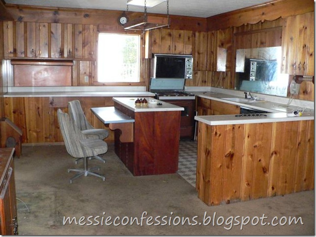
Here’s the old kitchen. I’ll be nice and call it rustic…
Here’s what I thought of rustic…
This is my new kitchen… isn’t she pretty?
Here’s the side that you see from the front entry. I went with a cooktop and a mantle-style range hood since it’s the focal point from the front entry… I’ll have to take more pictures, but the ceiling is an angled cathedral. The kitchen truly is the heart of my home.
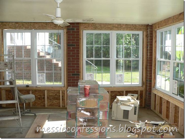
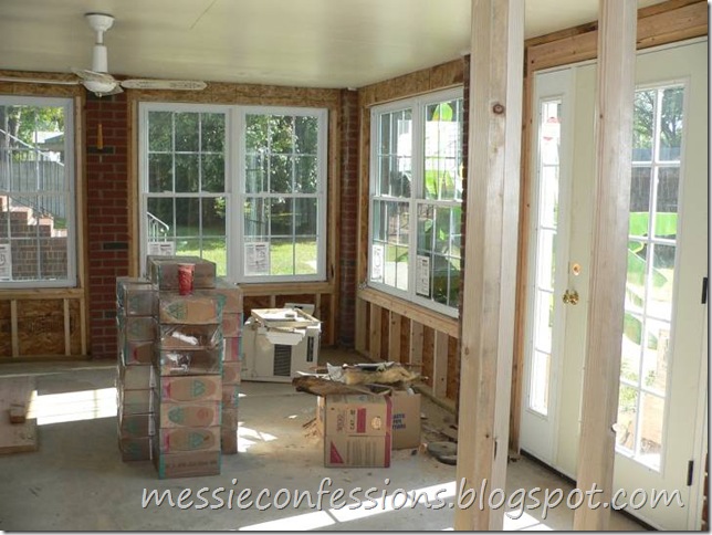
Here’s the sunroom downstairs (these are the photos that require the biggest apology). This is why the old back door irritated me so much. These stairs go straight up to the main floor of the house (kitchen and family room). To me, the back door should be situated opposite these stairs – so I had it moved…
Framing for the windows and doors…
New sunroom windows…
New sunroom door…
Inground pool complete with plenty of algae and a broken slide…
Many hours of cleaning later…
So, that covers a good bit of our remodel but not nearly enough. There's so much progress that’s been made since these photos (yay!) but of course, I have to organize all my new photos before I can post again. It’s going to be a crazy week, so perhaps I’ll get to this photo organizing project over the weekend and post Part II soon!
WOW! WOW! WOW!
The windows... THE KITCHEN!
Can I come over this summer and enjoy that beautiful pool too?


4 comments:
Cassity, thank you SO much for featuring our remodel! You're the best!
That is AMAZING!!! The kitchen is absolutely gorgeous. Love.
The results are amazing. Remolding is so much work and takes lots of time and patience. You go girl!
OH I LOVE A REAL LIFE HOME MAKEOVER THANKS SO MUCH FOR POSTING, Gives me Hope I can do the same some day with my 70's Boxy house! It looks magnificent!
Post a Comment