Such a Pretty Face, Clock Tutorial, Guest Highlight
26 April 2010

This party highlight is a great tutorial from Lemon Tree Creations. The girls over there usually have fabulous ideas be sure to check their blog out. I know we have seen this clock around. A lot of us, including myself noticed how cool it was in the Pottery barn magazine (picture below). I sent the image to my sponsor The Big Clock Store (which happens to be my sister's incredible business by the way) so she could check it out. (But as for blogs I first saw this idea on Alchemy Junk, which seem s to be inspiring us all)
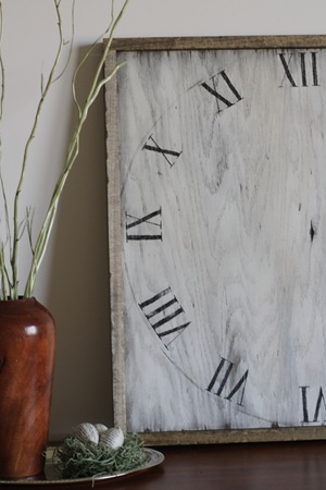
Her is what the Erin at Lemon tree has to say: We have lived in our house for about a year and a half at this point, and up until now I have been angry with my long blank kitchen wall for it’s inability to be decorated. Until now. Thank you Pottery Barn, as always. Look past the couch, to the table, and there it is! Cool, old, worn out looking clock face.
![pottery barn clock_thumb[2] pottery barn clock_thumb[2]](https://blogger.googleusercontent.com/img/b/R29vZ2xl/AVvXsEgJTdv6XP2Xob552cquj3ArJUMZz5J_2sSyqZpSoWU-rKHATgls2dCqkfU-IeilZZDUgxlGFrEOZRD0zHKWZzuc25M8662xYZ_wn7Q12zgG4iLYdfIMEazs65aSAhTe8PKOLp6FZWDeh6d-/?imgmax=800)
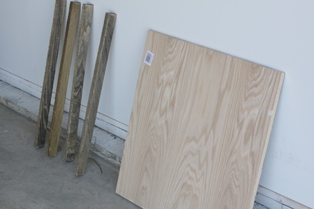
Alchemy Junk made a beautiful copy of this a few months ago, and I was inspired to take matters into my own hands to get a beautiful worn out clock face for my long empty wall. I made my way to Lowes for some wood as soon as I could after seeing this PB picture. I couldn’t find flat piece of wood for under $30 and I really wanted to spend a lot less than that, so I headed out with a 2x2 piece of oak plywood, (ugh, plywood), and some poly wood planks to cover up the plywood evidence. (In the picture below the planks are already stained, and the plywood is not.)

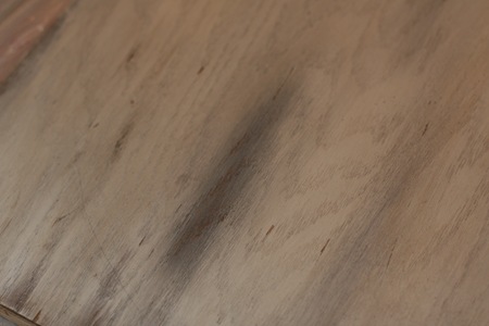
I knew that I wanted the wood color to show through underneath the white of the clock, so I first stained the board a dark walnut color. I let that dry for a few days so that it was completely dry and non-oily. I then whitewashed it, using some watered-down white paint, to give it a grayish sort of look, and after that was dry, I dry brushed white paint on top being careful to let some of the walnut and grayish colors peek through. I wanted a worn look and layering the colors seemed the best way to go.

I printed off some different sized fonts from my computer, and ended up with Bodini MT Condensed, size 250, because I wanted the numbers to be big, but slender. I then used my tried and true transfer method: traced the backs of the numbers in pencil, placed them where I wanted them on my board, rubbed over the front of the letters so that the outline would transfer, and then filled them in with paint. I didn’t actually get any pictures of this stage of the process, but I used a similar method with my Welcome sign, which you can see here. I painted on the 12, 3 and 6, and then lost my patience and decided to get on with the distressing.

I took my scraper and started kind of beating up the wood. I wanted it to have lots of dings and scratches in the finish. I also carved out a big hole in the center of the wood where the clock hands would have been.

I scraped roughly across the edge of the wood, and since I had never sanded it, the wood chipped off nicely.

I then held my scraper so that it was parallel with the grain of the wood, and scraped across the face of the clock letting it pull out little splinters here and there. The wood was relatively soft, so I randomly stabbed the scraper into the wood and pulled out a few more splinters.

I got my wire bristled brush and used that to rough up the wood a bit more. I rubbed it on the wood in the direction of the grain, and I was pleased to see that it was even more helpful than I had expected.


And now it was time for the glazing. I dipped a wet rag into the glaze, and started rubbing it all over the clock. I made sure to get a concentrated amount into each of the cracks in the wood and along the edges. I took a thin paintbrush and painted undiluted glaze into the big cracks because I wanted a dark black look in the bigger holes. I then rewet my cloth and randomly wiped the glaze off, letting the whitewash effect and the brown wood peek through.

I tied one end of a string around a pushpin and put it in the middle of the board, and the other end around a pencil, and used this to trace a circle all around the wood. This was a lot more difficult than it sounds, the pencil kept wanting to follow along the grooves in the wood instead of making a nice curve, but after several tries I finally got it. I filled in the pencil line with undiluted glaze, and used the glaze to paint on all of my numbers as well. Then I simply wiped across the numbers and circle to fade them. {Edited to add: Once finished, I thought the glazed and faded numbers were a bit too light, so I painted back over them with black acrylic paint, and gave them a light sanding.}

I stained the poly wood planks the same dark walnut shade that I had used originally on the board, and when they were dry, I took each plank and banged it against the concrete stoop in the garage so that the edges would be roughed up as well. I was a little nervous that the boards would bounce back and hit me in the face, but it didn’t take too much force to bang them up and luckily I remained unharmed.

I then used Gorilla Glue and glued each of the boards around the clock face. Since this glue foams up as it dries, I made sure to put the line of glue towards the back of the board so that any foam would seep out onto the back of the clock face. And this is what I ended up with…


Now I just need to decide where to put my clock face, because it turns out that it doesn’t look as good in the kitchen as it does in every other room! Back to the drawing board…


5 comments:
I think she is a genius. It looks so good and yet it does not cost an arm and a leg. Its so easy to do. Great idea!
Au revoir,
Anne-Marie
this is a very nice home accent idea!
be sure to link all your recycled/revamped/refashioned projects here:
http://avidaccents.blogspot.com/2010/04/little-inspiration-link-party-time.html#more
Love it...i could totally see this in my home!
Awesome !!
I've always wanted a giant clock! Now to craft one - great! I have a link-up on Tuesdays and would love to have you stop by: www.craftedition.blogspot.com
Post a Comment